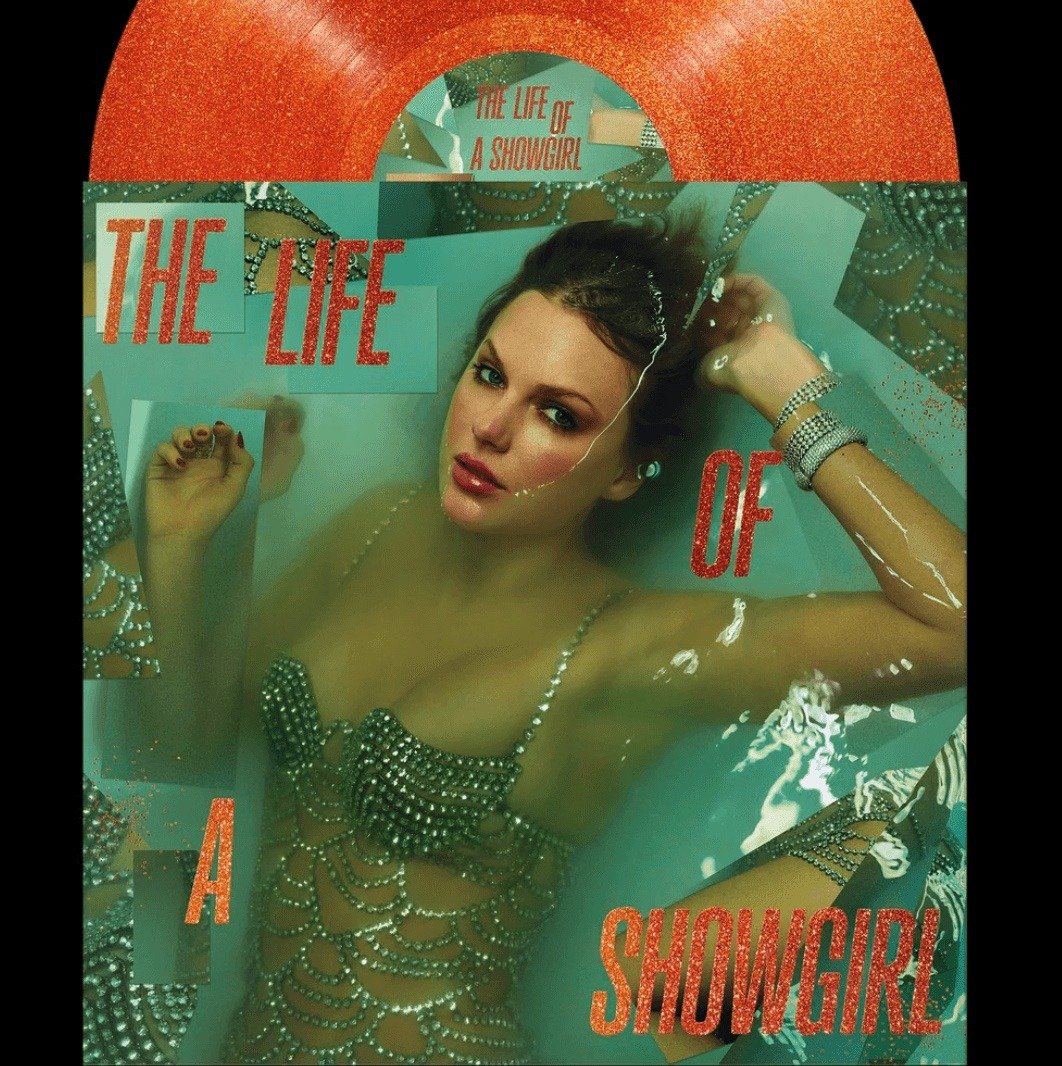
Taylor Swift’s new album, The Life of a Showgirl, hasn’t even dropped yet, and it’s already dominating the internet. From the bold orange-and-mint color palette to the striking bathtub imagery, every detail of the cover art has fans theorizing about Swift’s next era. But there’s a story hidden in plain sight that many haven’t caught: the font on the cover comes straight from Nicaragua.
The sleek letters spelling out The Life of a Showgirl are part of Gazzetta, a typeface designed by Nicaraguan graphic designer Edwin Moreira Balladares. Described as “friendly and energetic,” Gazzetta is now in the global spotlight, cementing Moreira’s work on an album that’s destined to be studied, memed, and remembered for years.

For Moreira, this moment is more than just a professional milestone—it’s a cultural breakthrough. A pioneer of typographic design in Latin America, he’s spent years elevating the visibility of regional design. His fonts have won awards and international recognition, but Swift’s choice of Gazzetta is by far the most high-profile showcase yet.
“My Instagram was filled with followers in a matter of hours. It’s impressive,” Moreira admitted after the reveal. Design colleagues across Latin America quickly celebrated the news, calling it a “highly visible global project associated with a figure of enormous cultural relevance.”
And they’re right. For a Nicaraguan typeface to sit front and center on a Taylor Swift album isn’t just a design win—it’s a powerful reminder that Latino creativity is shaping culture everywhere, from music to fashion to visual design.
So while Swifties pore over Easter eggs and dissect every aesthetic choice, one thing is certain: The Life of a Showgirl is also a win for Nicaraguan and Central American design, pushing Moreira’s craft—and the region’s creative voices—onto a global stage.


0 Comments